Evaluation
[ THE USER TESTS ]
[ THE FINDINGS ]
We used two parallel evaluation methods to refine our combined prototype: usability testing and heuristic evaluation.
We asked potential users to perform key tasks on our combined prototype to assess its usability for common use cases. Key findings are highlighted below.

Tester 1 - Tim
Visual Hierarchy and Organization: Although the comparison page was well-organized, they found the spacing insufficient, making it difficult to clearly distinguish between items.
Tester 2 - Sally
Ease of Navigation: Expected the "Compare" button to be in the top right corner and took time to adjust to its placement at the bottom, causing initial confusion.
Feature Accessibility: Found the search bar useful but thought it was too small and not noticeable enough on first use.


Tester 3 - Kelvin
Additional: Suggested that decision-making could be challenging without guidance on energy-efficient products
Task Completeness: Had difficulty locating energy ratings on product tiles, suggesting they weren’t prominent enough in the comparison view.
[ THE EVALUATION PROCESS]
We conducted an internal review of our combined prototype using Nielsen's Heuristics.
[ WHY TEST? ]

This testing focuses on understanding user challenges, specifically related to the problems identified in the initial heuristic evaluation.
Our group has created some key tasks that users will attempt to complete on their own.
This usability test will focus on critical aspects of the app prototype, aligned with the key problems identified in the initial heuristic evaluation - particularly the ones involving the 3 key scenarios.
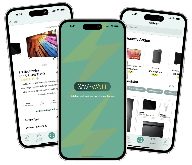
Task 1
Add and Remove Items from Wishlist
Objective: Test visibility of system status and error feedback.
Scenario: Users will search for appliances and add two items to their wishlist, then remove one item.
Success Criteria:
Users should be able to add items to the wishlist and receive confirmation feedback.
Users receive clear feedback when removing an item..

Task 2
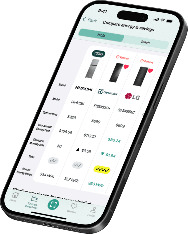
Task 2: Compare Multiple Products
Objective: Evaluate consistency, recognition, and navigation control.
Scenario: Users will select multiple appliances for comparison, then view and analyze the comparison screen
Success Criteria:
Users can identify and locate the “Compare” button without confusion.
Users can clearly view and understand the comparison information without struggling with cognitive overload.
Task 3
Task 3: Navigate Back to Home Screen After Clicking on an External Link
Objective: Test user control, freedom, and navigation consistency.
Scenario: Users are directed to explore specific sections (e.g., wishlist or comparison) and then return to the home screen.
Success Criteria:
Users can easily locate a “back” button or navigation path to return to the home screen.


Task 4
Task 4: Multi-Select Items for Comparison or Wishlist Addition
Objective: Assess flexibility and efficiency of use.
Scenario: Users will attempt to select multiple items to add to their wishlist or for comparison in one go.
Success Criteria:
Users can intuitively select multiple items without excessive time or effort.
Task 5
Task 5: Error Handling During Wishlist Addition
Objective: Test error prevention and feedback clarity.
Scenario: Users will try to add an item to the wishlist in a scenario where an error message is triggered (e.g., no internet connection).
Success Criteria:
Users receive clear and informative error messages that help them understand the issue.

Task 6
Objective: Assess match between system and real-world expectations and help/documentation clarity.
Scenario: Users are asked to identify and explain the function of icons like the wishlist and comparison icons.
Success Criteria:
Users can recognize the icons without confusion or refer to available documentation/tooltips..
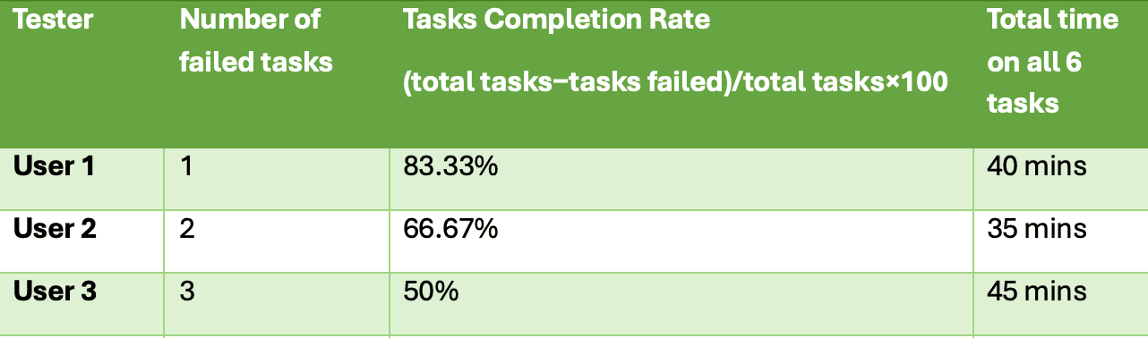
EVALUATION SCORE
Task Completion Rate: The percentage of tasks completed successfully without assistance.
Time on Task: The time taken by each user to complete each task.
Error Rate: The frequency of user errors during each task (e.g., mistakenly removing items from the wishlist).
This section identifies usability issues based on the initial version of the SaveWatt prototype

Visibility of System Status [HIGH]
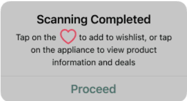
Limited feedback for actions like adding or removing items from the wishlist, leaving users unsure if actions were successful. Users only knew to tap the heart after prompting
Match Between System and the Real World [LOW]
Some icons, such as those for wishlist and comparison, might not be immediately clear without labels, creating confusion for new users.


User Control and Freedom
[HIGH]
Lack of visible “backˮ buttons or easy navigation paths in certain flows, especially after selecting multiple items for comparison, making users feel “trapped." during brochure scanning
Consistency and Standards
[HIGH]
Different pages had different colour schemes and look. Users felt they had to constantly re-orientate themselves again

Error Prevention
[HIGH]
No confirmation prompt when fields were left empty, allowing users to proceed without any information. Users were in a constant loop
Help Users Recognise, Diagnose, and Recover from Errors
[MEDIUM]
Limited error feedback for minor actions, such as unsuccessful additions to the wishlist, leaving users unsure about the issue

Based on the Initial user test, we improved the user interface, focusing on enhancing visibility to ensure a smoother, more intuitive user experience.
Visibility of System Status
Feedback messages will reassure users by confirming successful actions.
User Control and Freedom
Clearer navigation paths and “back” buttons offer more intuitive navigation and avoid a “trapped” feeling.
Consistency and Standards
Standardizing the “Compare” button location enhances predictability and reduces reorientation needs.
Error Prevention
Confirmation prompts and detailed error messages minimize accidental actions and guide error recovery.
Help and Documentation
Improved icon labels and tooltips will support first-time users in understanding features.
In the revised version, several usability issues have been addressed, resulting in a more intuitive experience with fewer problems. The users were given the prototypes to explore the updated features and provide feedback on the improvements made, especially regarding ease of navigation, task completion, and overall satisfaction.

Visibility of System Status
Added feedback messages for actions like adding items to the wishlist or comparison, providing clear confirmation of actions.
Match Between System and the Real World
Icons now have labels or tooltips, clarifying their functions for new users and improving overall understanding.


User Control and Freedom
A visible “backˮ button navigation has been introduced on more screens, allowing users to exit tasks easily.
Error Prevention
A confirmation prompt has been added for removal fields that require information. Preventing any NULL situation

Aesthetic and Minimalist Design
Minimalist yet modern design. Information on the comparison screen is now organized with collapsible sections or highlighted details, making it more scannable.
Help Users Recognize, Diagnose, and Recover from Errors
Improved error messages now provide specific information for minor issues, like or loss of internet connectivity

Help and Documentation
An optional quick-start guide or tooltips have been added to introduce key features, aiding first-time users.
HOME