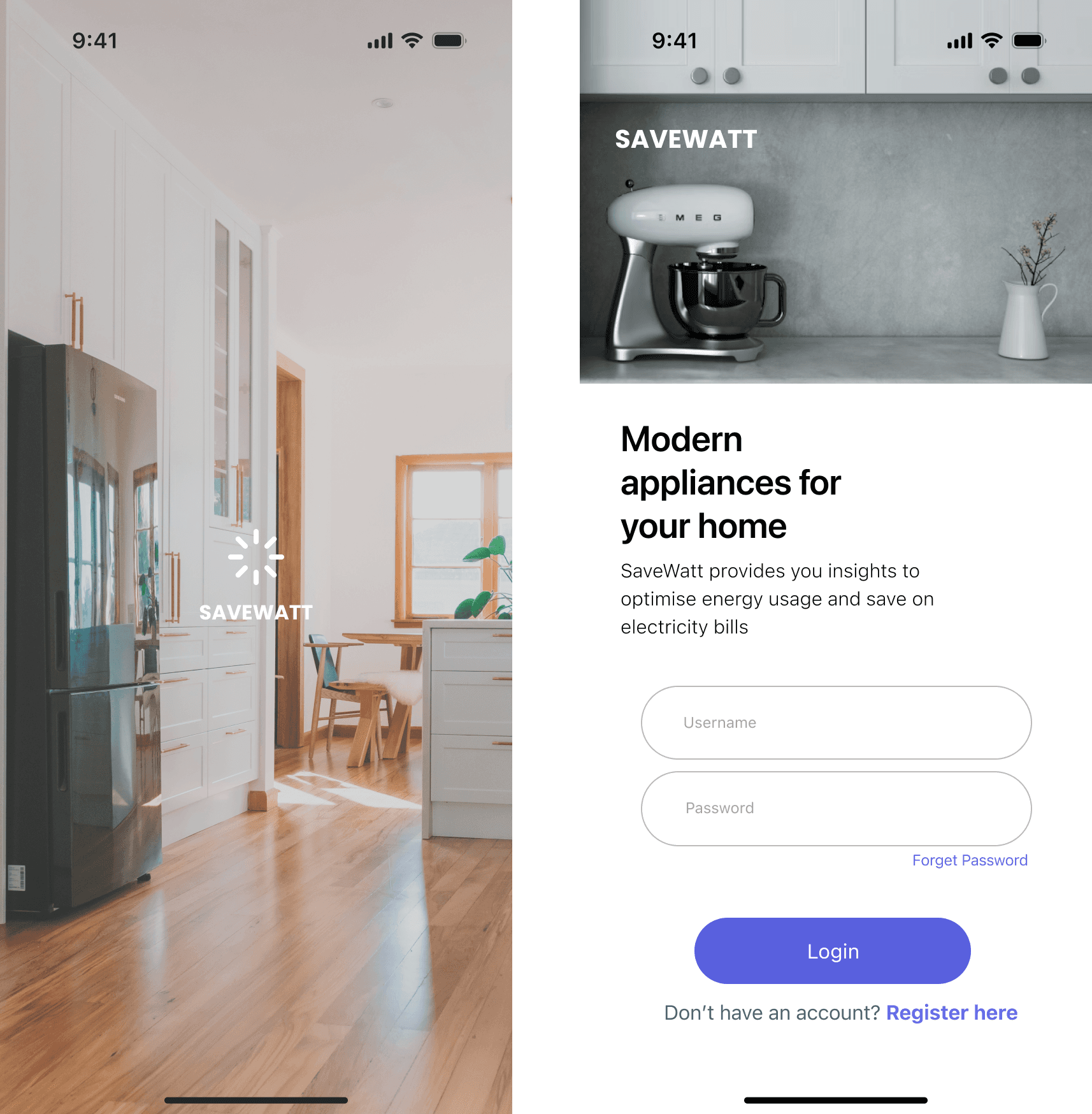
Prototyping
Once we defined user tasks and scenarios, we began creating prototypes. Each team member developed low-fidelity wireframe prototypes for one user task, using Figma. These prototypes served as a way to explore layout options for the UI.
After designing the low-fi prototypes, internal reviews were conducted within the team to assess strengths and weaknesses of each design.
Building on feedback from lo-fi prototypes, we refined the designs by addressing identified strengths, weaknesses, and suggestions. Each team member then created a high-fidelity prototype for one user task.
Each team member tested their interactive high-fidelity prototype with 1-2 target users, either actual homeowners or role-playing homeowners. The focus was on evaluating navigation ease, information clarity, and usability. Below is the summarized feedback:
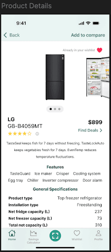
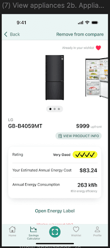
We combined the best elements from each individual prototype to create an integrated interactive prototype for usability testing. To ensure a cohesive design, our team established a set of design guidelines, which we followed throughout development.
Key improvements in the combined prototype include:
Retained Strengths: We preserved features like the intuitive comparison tool and engaging savings calculator, which testers found clear and relevant.
Addressed Issues: We resolved UI inconsistencies, sizing problems, and unclear instructions by standardizing color, typography, and interaction cues. We also added more user guidance to the brochure management feature based on tester feedback.
Severity Indicators: Issues were prioritized by severity during testing. Critical issues, like navigation problems, were addressed first, while aesthetic concerns were tackled later, ensuring a polished final prototype.


HOME