Reflection
Over the semester, we navigated various project phases, from user research to prototyping. This page captures our reflections and key takeaways from each stage of the SaveWatt project, showcasing our growth and development throughout the semester.
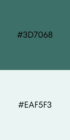
[ COLOUR PALETTE ]
The color scheme for SaveWatt prominently features shades of green, symbolizing sustainability and energy efficiency. This choice aligns with our mission to help users make informed, eco-friendly appliance choices.
Primary Colors:
#3D7068: A deep green is used for call-to-action buttons and important icons. It encourages user engagement by drawing attention to key actions like “Compare Features” or “Confirm”.
#EAF5F3: A soft green is dedicated to the navigation bar, providing a clear visual anchor for easy access to the app's core sections.

Secondary Colors:
#2E9D8B: A vibrant green for the scanner button in the navbar's centre emphasises the scanning feature and creates visual balance.
#F6F930: Bright yellow is used for energy efficiency ticks, which visually highlight appliances' energy ratings and help users spot energy-saving options.
#11917C: Used for secondary actions like “View Details” or “Cancel” buttons, offering a subtle contrast that helps users differentiate between primary and secondary functionalities.
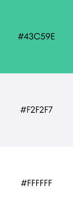
Supporting Colors:
#43C59E: Applied to general icons, ensuring a consistent and harmonious visual theme across the app.
#F2F2F7: Employed for general buttons and non-critical interactions, maintaining a minimalistic and unobtrusive design.
#FFFFFF: Used for the background, providing a clean, spacious layout that enhances readability and user focus.
#E7E7E8: Utilized for alerts, modals, and system messages, creating a neutral tone that draws attention without being overly distracting.
[ TYPOGRAPHY ]
SF Pro
Chosen for its clean, modern look and strong readability.
Aligns with Apple’s UI, creating a consistent experience on iOS devices.
Supports multiple font weights, enhancing visual hierarchy and usability.
Ensures optimal readability and a polished, user-friendly interface.

[ ICONS ]
SF symbols
Ensure design consistency with the font, maintaining the native feel of iOS, providing a familiar experience.
Clean, streamlined icons align with the app’s minimalist aesthetic.

[ Proximity & Readability ]
Related information was grouped together (e.g., appliance details, specifications) using the principle of proximity to enhance readability and understanding.
[ Symmetry & Harmony ]
Symmetrical layouts, primarily using grid systems, created a harmonious and predictable interface, reducing cognitive load for users.
[ Contrast & Visual Hierarchy ]
Contrast was employed to highlight important elements like calls-to-action and key information, guiding user attention and improving visual hierarchy.
[ Clear Calls-to-Action ]
Strategically placed "Compare" and "Next" buttons facilitated a smooth user flow and encouraged desired actions.
[ Continuity & Exploration ]
Carousel/gallery views with subtle swipe cues like pagination dots encouraged users to explore multiple product images or energy label explanations, creating a more engaging experience.
[ Location & Navigation ]
A clearly highlighted tab bar provided users with a consistent sense of location within the app, supporting easy navigation.
[ Familiar Language ]
Using terminology aligned with NEA standards ensured familiarity and comfort for users navigating the app.
[ Memory & Consistency ]
Consistent button shapes, layouts, and element behaviors throughout the app leveraged users' memory, ensuring predictable interactions and enhancing usability.
[ Understanding the Impact of Rising Energy Costs ]
We investigated how increasing electricity tariffs influence homeowner's appliance choices in Singapore. Defining the problem and target users (new and existing homeowners) was straightforward.
[ SURVEYS ]
Surveys provided efficient data collection and revealed key trends in energy consumption behaviors.
[ Interviews, CI, and the Challenges in Qualitative Research ]
Recruiting participants for interviews and contextual inquiries proved challenging. Analyzing qualitative data and synthesizing diverse user experiences required careful consideration and analysis.
[ Unexpected Insights ]
The research revealed an unexpectedly high reliance on sales specialists due to confusion surrounding online energy efficiency information and a significant knowledge gap regarding energy labels.
[ Importance of User Research ]
This phase highlighted the critical role of user research in understanding real-world behaviors and challenges related to energy consumption. This informed our design decisions moving forward.
[ Exploring Design Concepts ]
Low-fidelity wireframes facilitated the exploration of diverse design concepts, focusing on usability and task flow, allowing each team member to contribute unique solutions.
[ High Fidelity Prototyping ]
We translated initial concepts into detailed, interactive prototypes. Careful attention was given to visual elements, interaction details, and design consistency.
[ Collaboration over Combined Prototype ]
The combined prototype merged individual strengths into a cohesive design, highlighting the importance of communication and collaboration.
[ Iterative Design with User Feedback ]
This iterative process emphasized the value of user feedback and adaptation, strengthening our design and prototyping skills.
[ Combined Prototype Refinement ]
This phase focused on refining the combined prototype based on valuable user feedback. The goal was a seamless user experience that addressed initial design problems and key user tasks.
[ User Testing ]
User testing was crucial for identifying and addressing inconsistencies in UI elements, layout, and navigation.
[ Enhanced Cohesion and UX ]
Standardizing the color scheme, typography, and interaction cues significantly improved the overall cohesiveness and user experience.
[ Balancing Detail and Simplicity ]
User feedback highlighted the importance and difficulty of balancing detailed data presentation with simplicity and ease of use. This feedback directly informed design revisions.
Future iterations could improve on the usability of the app. These are some of the features we have considered.
[ Enhanced Usability & Advanced Settings ]
Ability to show/hide information, to empower users to tailor their experience according to their preferences.
[ Seamless Onboarding ]
A guided onboarding experience will welcome new users and introduce key features.
[ Virtual Home ]
Visualize energy impact with the "Virtual Home" feature (conceived during ideation), allowing users to see the combined energy consumption of their appliances per room.
HOME